“Packaging Is a Silent Salesman”
Elliott Abrams
Packaging design isn’t just about looking good or attracting attention. When done right, it becomes a powerful brand asset that shapes how customers remember, recognize, and trust a product. In this article, we’ll explore why brand recognition matters and how strategic packaging design can significantly enhance it, especially for healthy food brands.
Brand recognition refers to a customer’s ability to identify a brand without explicitly being shown the name. Instead, they recognize the brand through visual or auditory cues such as:
- Logo marks
- Packaging design
- Brand colors
- Typography
- Slogans or taglines
- Distinctive shapes
- Sound cues like jingles
When a brand is built effectively, people can identify it instantly through these elements alone. Think of the clean Scandinavian design of Oatly cartons, the vibrant packaging from Smart Sweets, or the signature amphora-shaped bottles from Califia Farms — these cues speak the brand’s name without needing to show the words.
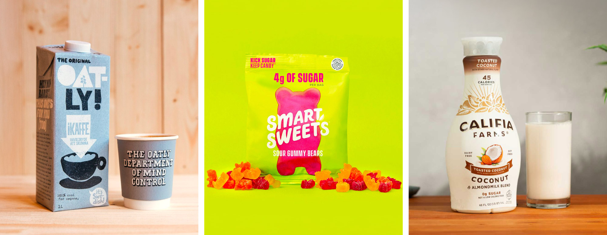
Photo credits: Left: Go Dairy Free, Middle: Health Products for You, Right: Smith Brothers Farms
The benefits of high brand recognition
Strong brand recognition goes far beyond aesthetics. It directly influences customer behaviour and long-term business performance. Brands with high recognition can:
Build trust more quickly
Familiarity creates comfort. When customers repeatedly see consistent brand cues, they associate the brand with reliability and feel more confident purchasing—especially in the competitive healthy food market.
Create loyal customer communities
Recognizable brands develop emotional ties with consumers. Over time, this can turn one-time buyers into loyal fans who advocate for the brand and choose it consistently over alternatives.
Stand out from competitors
Supermarket shelves are crowded. Clear and memorable visual identity helps your product immediately distinguish itself from similar offerings, dramatically improving visibility and recall.
Boost sales and repurchase rates
A well-executed packaging redesign can produce measurable results. Research shows that strong brand recognition can increase customer recall by 20–50% when packaging is strategically refreshed. Higher recall leads directly to higher repurchase rates and attracts new customers who remember the brand.
How Does Packaging Design Influence Brand Recognition?
Now that we understand the importance of brand recognition, the next step is to explore how packaging design directly contributes to it. Packaging is more than a container—it’s a strategic branding tool that shapes how customers perceive, remember, and choose a product. Below are several ways packaging design strengthens brand recognition and drives consumer behavior.
First point of contact
Whether on a physical store shelf or displayed digitally on an online marketplace, packaging is the very first touchpoint between your product and potential customers. The design visually communicates what the product is about before a customer even reads the label. If the visual impression is strong and trustworthy, customers are more likely to explore further and learn more about the product. In other words, strategic packaging design must capture attention instantly—it’s your first chance to make customers stop, notice, and engage.
Differentiation from competition
A well-crafted design helps your product stand out in a crowded market. Shelves—both online and offline—are noisy, competitive spaces with dozens of similar options side by side. If your packaging can be easily spotted and distinguished at a glance, you’ve already won half the battle. Research shows that exceptional packaging design can increase a customer’s purchase intention by approximately 23%, demonstrating how visual appeal directly influences buying decisions.
Building a strong brand identity
A distinctive brand identity acts like a mental imprint in the customer’s mind. When people think of a product category—such as yogurt, protein bars, or plant-based snacks—the strongest brands appear first because their visual identity is memorable and consistent. Effective packaging design reinforces this identity again and again, helping your brand stay top-of-mind in a highly competitive field.
Communicating brand values
Packaging design is one of the clearest ways to express what your brand stands for. Color, typography, materials, finishes, texture, and even structural design all convey meaning. For healthy food brands, this might include using natural tones to express freshness, clean layouts to signal transparency, or eco-friendly materials to highlight sustainability. Every design choice becomes a cue that communicates your brand’s values instantly.
Conveying essential product information
Today’s consumers are more conscious than ever about ingredients, nutrition, and overall health benefits. Clear, well-organized information on the packaging helps build trust and reduce hesitation during the buying process. Highlighting key benefits—such as “high protein,” “organic,” or “no added sugar”—helps customers quickly understand the product’s value. Packaging that communicates effectively not only improves comprehension but also helps the product stand out in a meaningful way.
Emotional appeal
People make decisions emotionally first, then justify them logically. Packaging design can amplify or soften emotions strategically when executed with intention. Emotional cues—whether through color, imagery, materials, or storytelling—play a major role in shaping customer preference.
6 Ways to Increase Competitiveness Through Packaging Design
Design is often seen as subjective—one person may love a layout while another disagrees entirely. But while individual opinions vary, the majority of consumers respond to design elements in surprisingly consistent ways. This is why packaging design can be measured, evaluated, and translated into meaningful metrics that help brands create strategic, high-performing packaging that sells.
Below are six packaging design strategies—supported with real healthy food brand examples—to help illustrate how to create competitive, conversion-driven packaging.
1. The strategic use of color
Color psychology is not new, but its impact on packaging performance is significant. Colors trigger emotional and subconscious associations:
- Red = energetic, bold, active
- Yellow = youthful, optimistic, innovative
- Purple = creative, whimsical
- Green = natural, trustworthy, healthy
Brands that use color strategically can shape how consumers perceive the product before they even read the label.
Example: Hippeas
Hippeas’ bright green and yellow packaging creates powerful positive effects.
- Green signals health, naturalness, and trust—especially for organic foods. Research shows it can increase willingness-to-pay from M=4.18 to M=6.06 on a 7-point scale among health-conscious buyers.
- Yellow boosts brand recognition by up to 80%, helping healthy snacks stand out on crowded shelves.
This combination strengthens visibility, emotional appeal, and overall brand memorability.
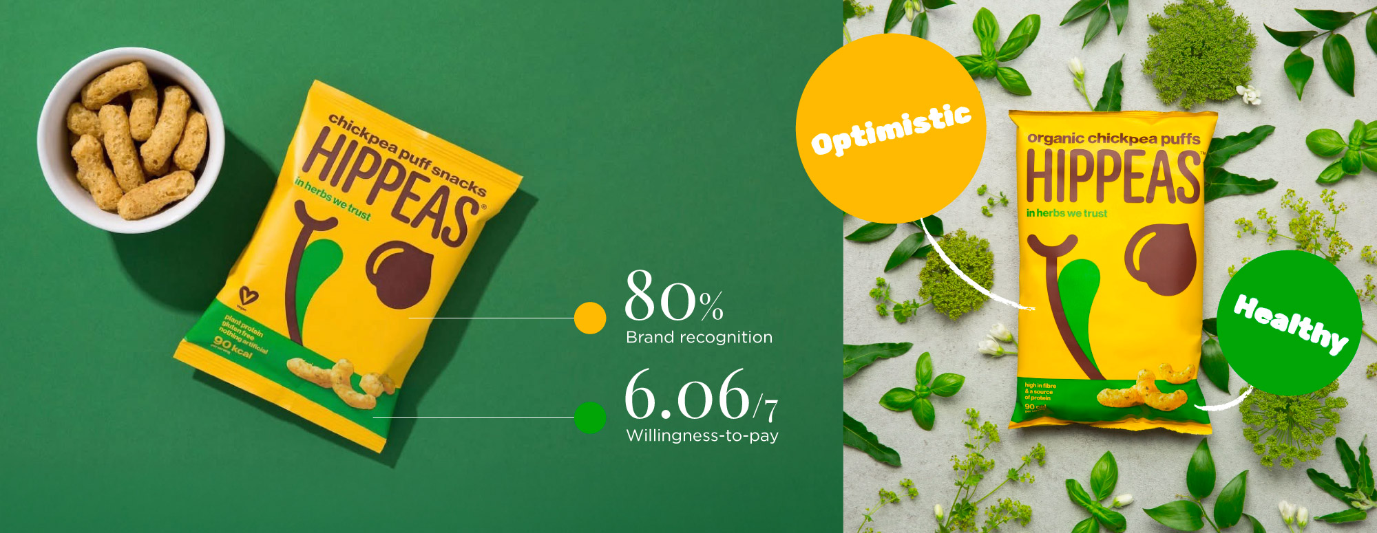
Photo credit: Hippeas (Facebook)
2. Structural shape
Now imagine a shelf full of standard rectangular milk cartons—then suddenly, a sculptural amphora-shaped bottle appears. Our instinct is to pause and look closer. Atypical shapes break the visual pattern, grabbing attention and signaling care, innovation, and quality. Shape becomes a form of branding—something customers can spot from across the aisle.
Example: Califia Farms
Califia’s iconic bottle shape transformed the brand from typical to instantly recognizable. Experimental studies on atypical packaging in healthy food categories show that distinctive forms can increase product appeal and purchase intention by 0.5–1.0 points on a 7-point scale.
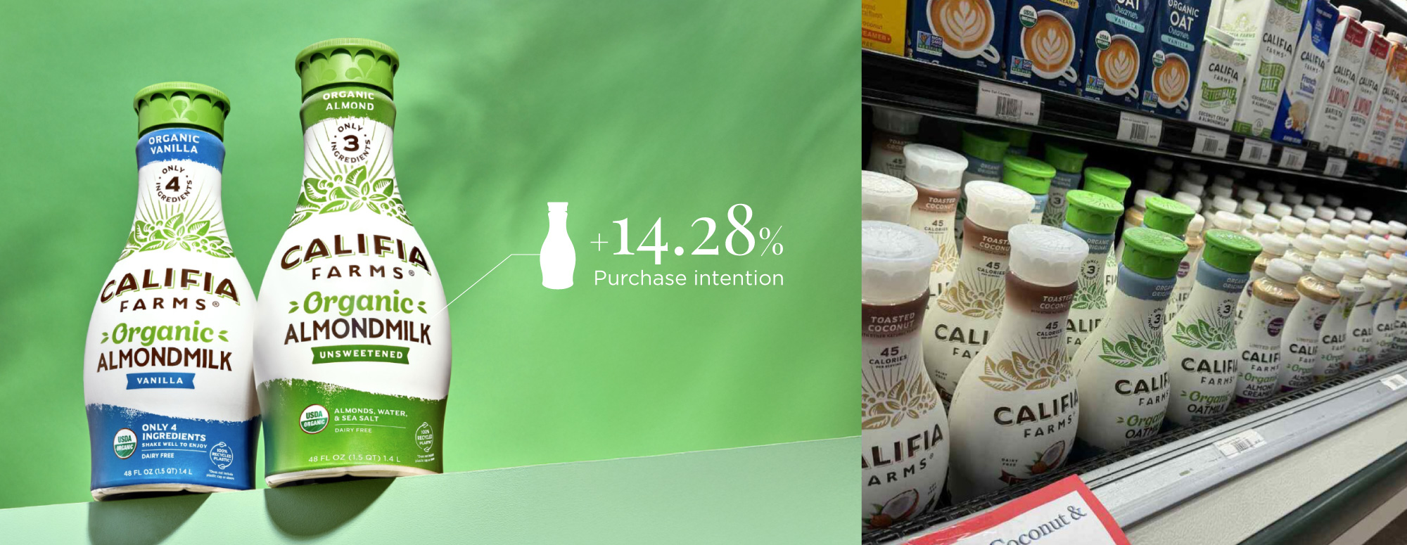
Photo credits: Left: Instagram@califiafarms, Right: Instagram@peterscornucopia
3. Reading sequence & visual hierarchy
Consumers typically scan packaging in a Z-pattern or F-pattern (left to right, then downward), giving only 3–7 seconds before making a decision. Strong hierarchy guides the eyes and reduces cognitive effort, increasing purchase intent by 20–30% in food categories.
Effective hierarchy prioritizes:
Brand name/logo (top third, largest element)
Product descriptor or flavor (center area)
Key benefits (“Organic,” “High Protein,” etc.)
Imagery (product or lifestyle visuals)
Callouts (claims, seals, or CTA)
Brands that follow this structure see a 15–25% increase in shelf take rate because benefits become instantly scannable.
Example: RXBAR
RXBAR revolutionized the category with its “No B.S.” ingredient-first design.
- Sales grew from $2M in 2014 to $160M in 2017.
- Kellogg’s later acquired the brand for $600M.
- The design inverted typical hierarchy—listing ingredients larger than the brand name—which created intrigue, transparency, and trust.
Packaging became the brand’s engine for 80x growth.
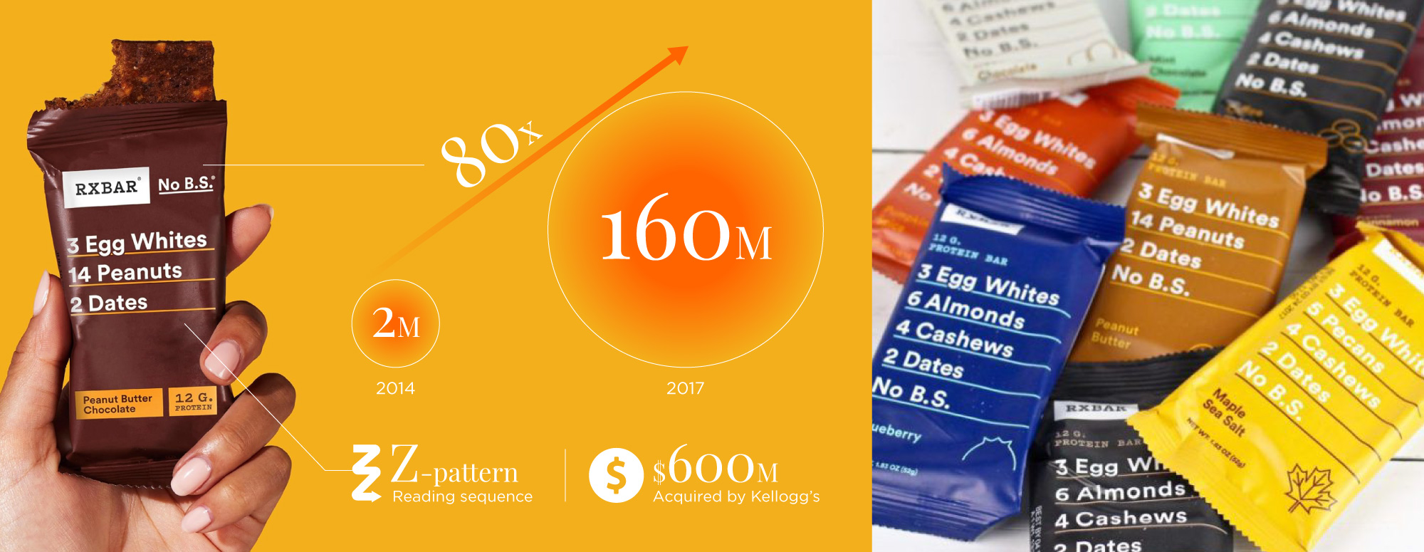
Photo credit: Left: Amazon, Right: Pinterest @The Real Food Dietitians
4. Material choice & texture
Material choices—especially tactile finishes—communicate brand quality and personality.
- Foil and embossing increase perceived quality by 35–45%.
- Textured finishes increase shelf engagement by 2–3 seconds, boosting choice probability by 15–20%.
- Matte, gloss, or metallic finishes can shift a consumer’s perception from “basic” to “premium.”
Example 1: Halo Top Ice Cream
Halo Top used pearlescent foil lids and spot gloss varnish to evoke freshness and purity. These upgrades made low-calorie pints feel more indulgent, helping sales skyrocket from $4M to $340M before acquisition.
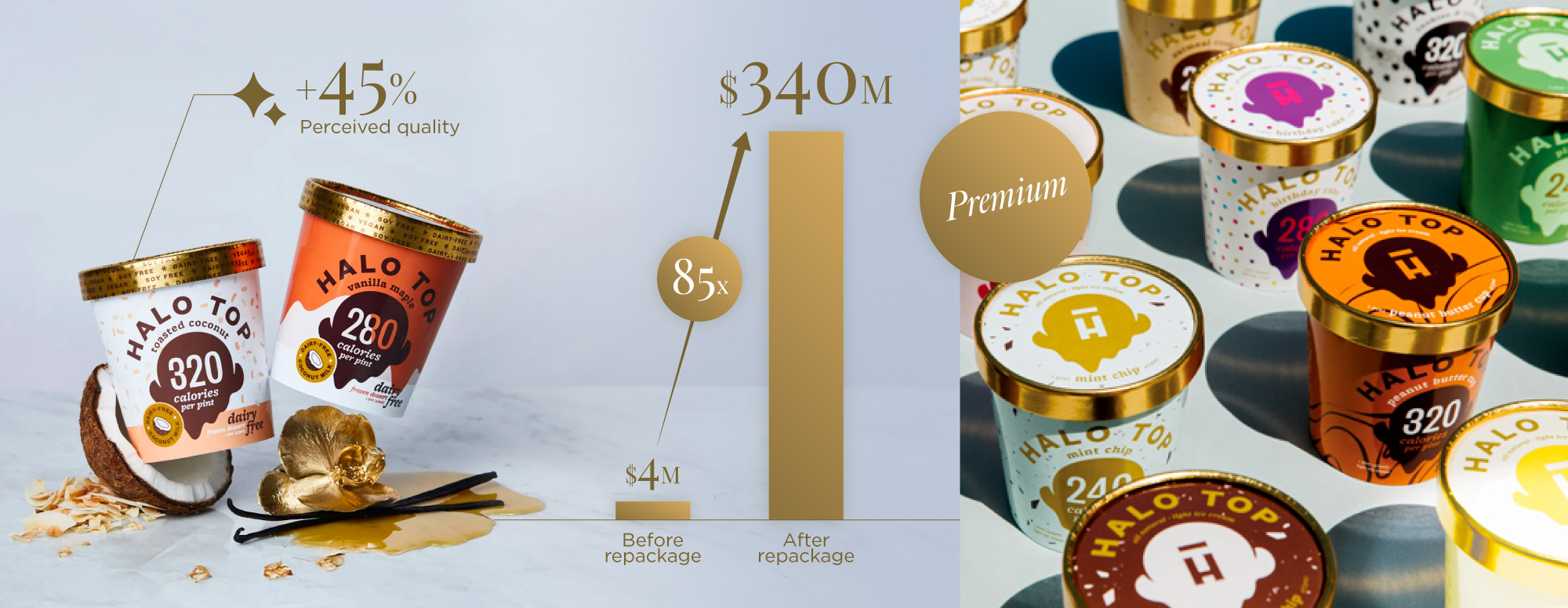
Photo credit: Left: bon appetit, Right: Los Angeles Business Journal
Example 2: Blume Superbelly
Blume uses gold foil stamping and embossed textures on matte pouches, creating a spa-like, wellness-forward feel.
- Sold out within 2 weeks of launch
- Drove rapid retail adoption and 300% YoY growth
- Thick matte material plus gold details elevated perceived value dramatically
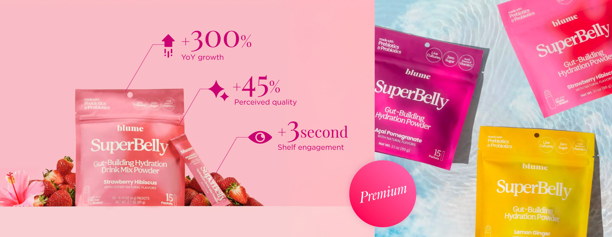
Photo credit: Left: Blume Official Website, Right: Grant Design
5. Sustainability
Eco-friendly packaging is no longer optional—it’s a purchase driver. Studies show that recyclable or eco-friendly materials can increase purchase intent by 20–30%, as customers associate sustainable packaging with health, purity, and responsibility.
Example: Cambio Roasters
Cambio redesigned its coffee pod packaging into recyclable molded pulp containers with glue-free paper belly bands, eliminating traditional plastic and fiber cartons.
Results:
- Winner of the iF Design Award 2024
- Expanded from limited launch to 5,000+ stores (Walmart, Harris Teeter, Hannaford, Giant Martin) by 2025
- Targeting 200M pods annually and $150M revenue by 2030
Sustainability became a differentiator and growth engine.
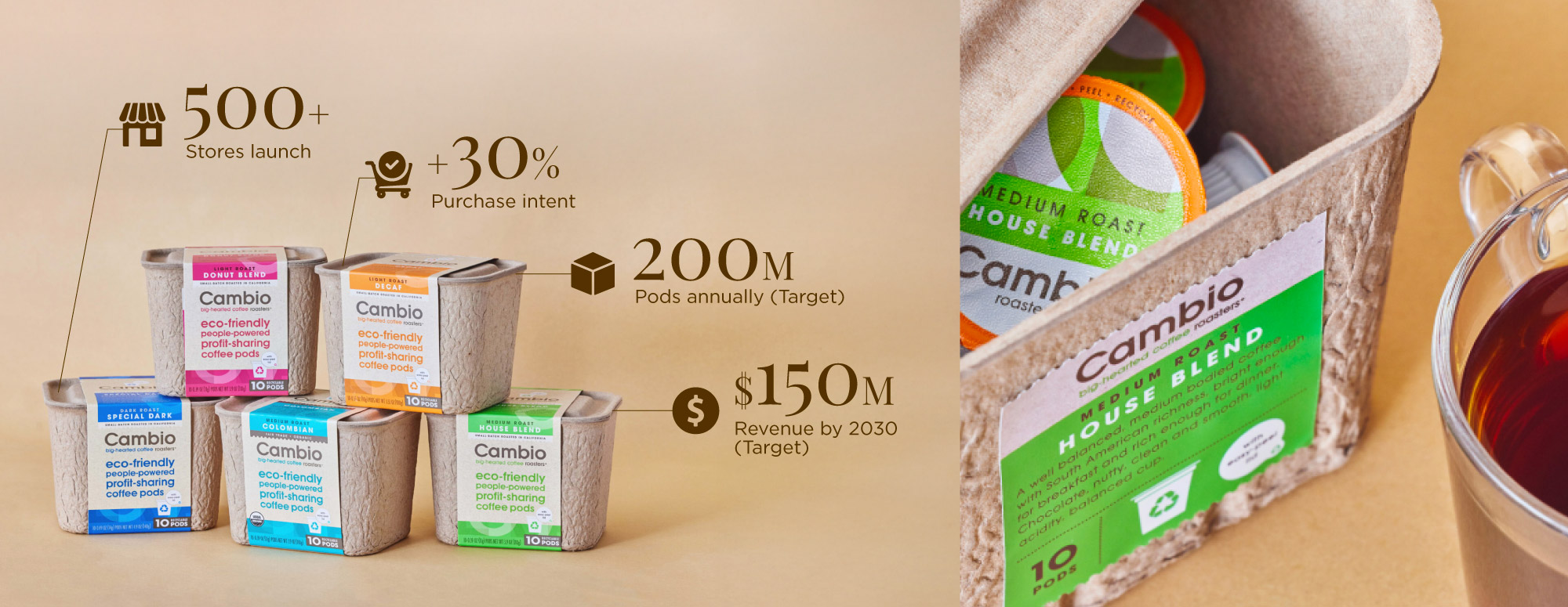
Photo credit: Packaging of the World
6. The unboxing experience
Unboxing isn’t only for luxury or tech brands—healthy food brands use it to drive delight, shareability, and repeat purchases. Clever functional details enhance the customer experience and reinforce brand personality.
Example: Magic Spoon
Magic Spoon uses resealable bags with a window, and the unboxing reveals the cereal along with a custom spoon inside for portion control and ready-to-eat convenience. The experience offers:
- Instant “open and eat” convenience
- Fun, collectible unboxing moments
- Strong DTC performance boosts (25% conversion lift from unboxings)
These packaging features helped the brand scale to $50M+ ARR by 2023.
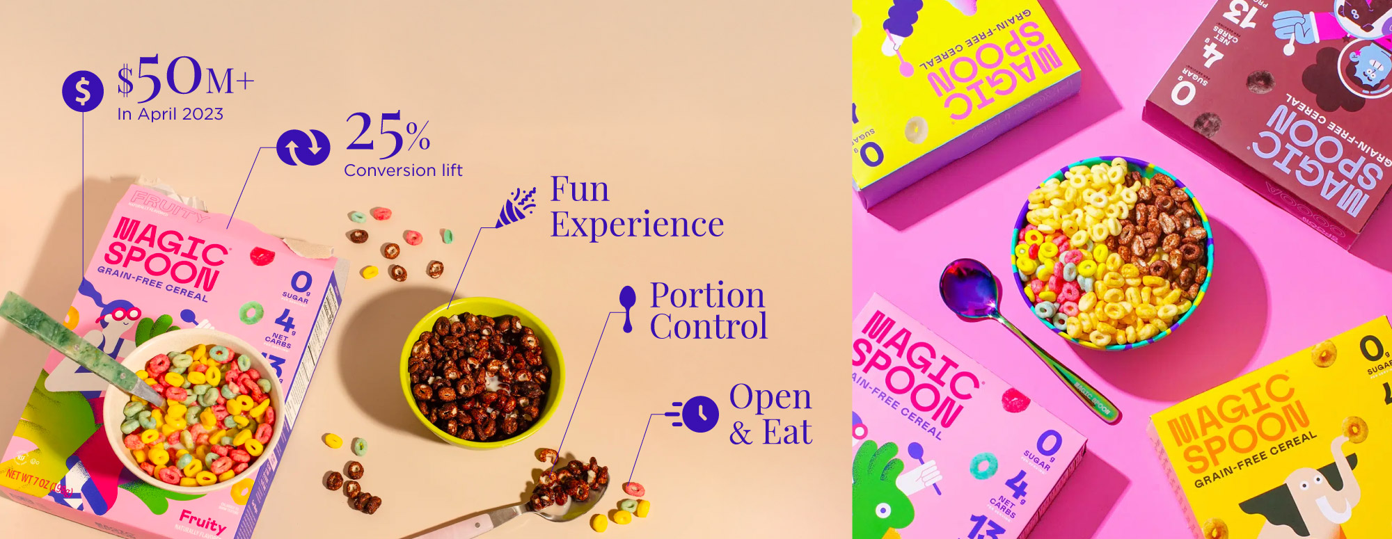
Photo credits: Left: Wirecutter, Right: Ultimate Meal Plans
Packaging design is not guesswork—it can be informed by real human behavior, measurable data, and proven psychological principles. Every design decision, from color to typography to structure, should be intentional and rooted in evidence, not preference. When brands rely on data-backed strategy, packaging becomes a sales engine, a recognition tool, and a brand storyteller.
By applying the principles outlined above, you’ll be better equipped to create packaging that not only looks appealing but also resonates with your target audience, stands out on the shelf, and ultimately drives conversion and loyalty.
Wishing you a successful launch and a brand presence that customers can spot—and remember—in seconds.
Get Updates from Falcon Glide Studio
Get fresh tips, how-tos. and expert packaging advice from us.